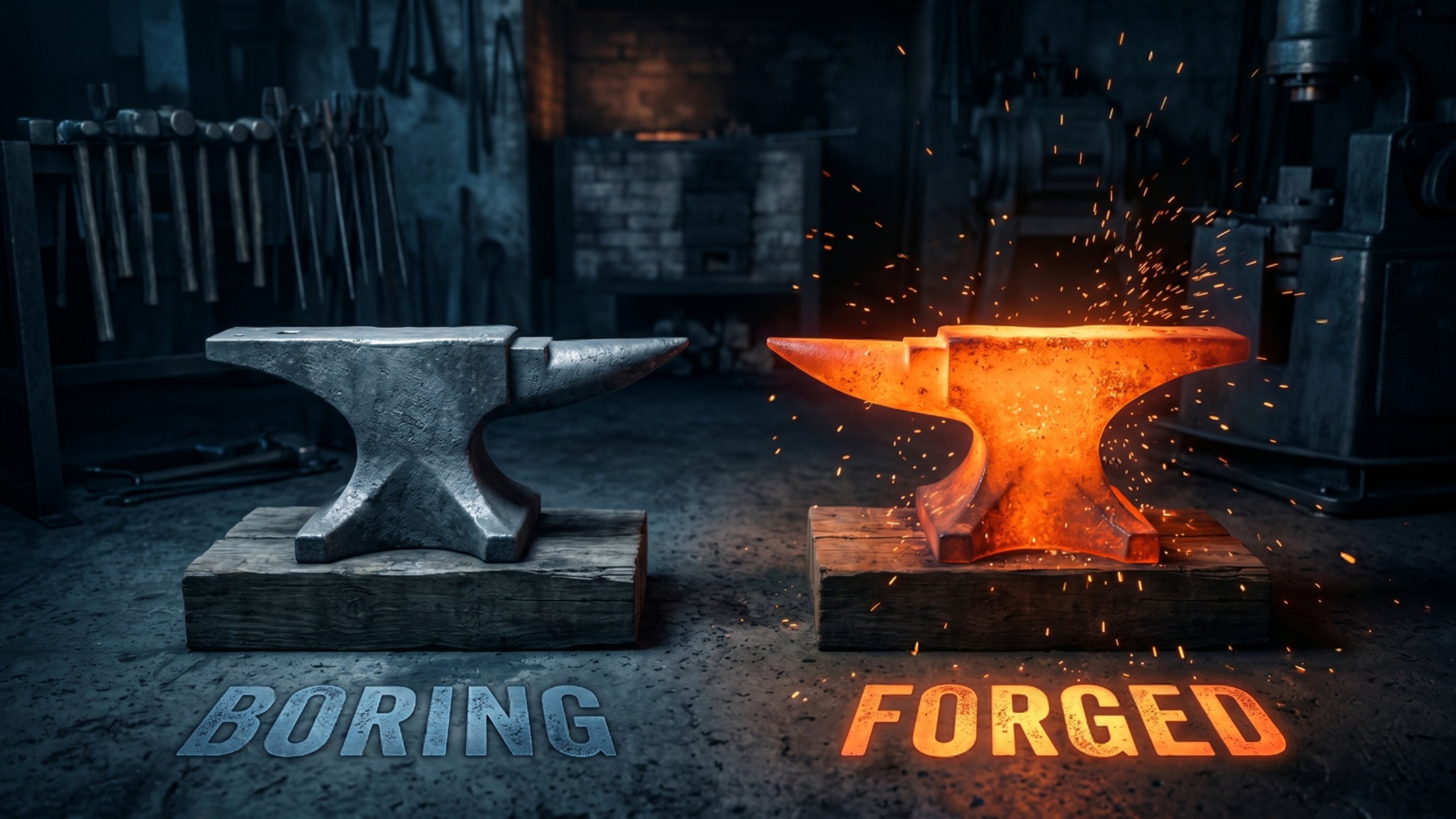
Your Website Is Not Broken. It Is Just Boring. That Is Worse.
When a website breaks, someone fixes it. The contact form stops working, you get a complaint, you call someone, it gets handled. Broken is loud. Broken gets attention.
Boring is silent. And silent is what kills small businesses.
A boring website does not throw an error. It does not crash. It loads fine, the links work, the phone number is right. By every technical measure, it is working. And it is still costing you customers every single day, because working and winning are not the same thing.
Here is the problem with boring. Nobody tells you. The visitor who landed on your forgettable homepage, felt nothing, and left does not file a complaint. They just forget you existed by the time they reach the bottom of their search results. You never know they were there. You never know you lost them.
That is why boring is worse than broken. Broken you can see. Boring hides.
What boring actually means
Let me be specific, because "boring" sounds like an insult and I do not mean it as one. Boring is a measurable set of problems.
Boring is when your homepage could belong to any business in your industry. Swap the logo and nobody would notice. Same stock photo of people shaking hands. Same headline about quality and trust. Same three service boxes. If your website is interchangeable with your competitor's, you have a boring website, and the customer has no reason to pick you.
Boring is when nothing on the page makes a visitor feel anything. No curiosity, no recognition, no "oh, that is exactly my problem." Just beige. People do not buy from beige. They buy from businesses that make them feel understood.
Boring is when there is no point of view. The best small business websites take a stance. They say "here is who we are for, here is who we are not for, here is what we believe." Boring websites try to appeal to everyone and connect with no one.
Why good businesses end up with boring websites
This is not a competence problem. It is a default problem.
When you use a template, you get a template's personality, which is no personality. The template was designed to work for a dentist, a plumber, a yoga studio, and a law firm all at once. To do that, it had to be generic. You did not choose boring. You inherited it the moment you picked a one-size-fits-all solution.
Same thing happens with cheap builds. A freelancer working fast on a template they have used fifty times is not going to stop and ask what makes your business different. They are going to fill in the blanks and ship it. The result works. It is also forgettable.
So you end up with a website that reflects the tool that built it instead of the business that owns it. And the tool has no personality, so neither does your site.
The cost of beige
Here is the math that matters.
Your competitor down the street might have an objectively worse website than yours. Slower, uglier, older. And they might still be winning, because their site has one thing yours does not: a reason to remember it.
Maybe their headline actually says what they do. Maybe they have one real photo of the actual owner instead of a stock image. Maybe they took a clear stance on who they serve. Any one of those things makes them stickier than a polished but personality-free site.
Polish does not win. Memorability wins. And boring is the absence of memorability.
Every visitor who leaves your site feeling nothing is a customer you paid to acquire, through ads or SEO or word of mouth, and then lost at the door because the room was beige. That is the bill you never see.
How to tell if your site is boring
Run this test. Show your homepage to someone who does not know your business. Give them 10 seconds. Take it away. Then ask them two questions.
What does this business do? And what is one thing you remember about it?
If they can answer the first but not the second, your website is boring. It is communicating, but it is not connecting. It is working, but it is not winning.
Most business owners are shocked by this test, because they assumed a clean, professional, working website was the goal. Clean and professional is the floor, not the ceiling. The goal is memorable.
What we do instead
When we build a site, the first thing we hunt for is the thing that makes you not boring. The real photo of the real owner. The specific promise nobody else in your market is making. The point of view. The reason a stranger would remember you after they close the tab.
Then we build the whole homepage around that. Bold websites for bold brands is not a slogan we picked at random. It is the entire point. A bold website is a memorable website, and a memorable website is one that actually gets remembered when the customer is ready to buy.
See your site rebuilt in 48 hours. Free.
Here is the fastest way to find out if your site is boring. Let us rebuild it.
It is called The 48-Hour Homepage. Send us your current site. In 48 hours we send back a rebuilt homepage, free, built around the thing that actually makes your business worth remembering. You will see the difference immediately, because boring and bold sitting side by side is impossible to ignore.
You only pay if you want the full site. The mockup is yours either way.
The hardest part of fixing a boring website is seeing that it is boring in the first place. So let us show you. Side by side. Then you decide.