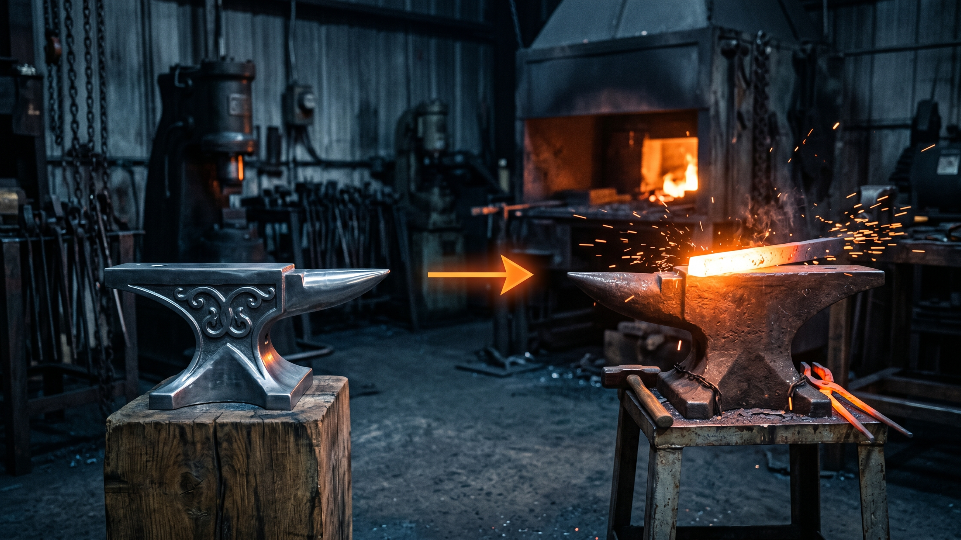
Your Competitor's Website Is Worse Than Yours. They Are Still Winning. Here Is Why.
You have looked at their website. Be honest. You thought "mine is better than that."
And maybe it is. Maybe theirs is older, uglier, clunkier. Maybe the design is dated and the photos are bad. And they are still pulling in the customers you want. It does not seem fair, and it does not seem to make sense.
Here is what is actually happening. A website has one job. Not to look good. To turn a visitor into a customer. Their worse looking site is doing that job better than your nicer looking one. Looks are not the game. Conversion is the game. And conversion is a different skill than design.
Let me show you what they are doing right, so you can do it better.
Pretty is not the same as persuasive
A beautiful website that does not convert is an expensive piece of art. A plain website that converts is a salesperson that works 24 hours a day.
Most small business owners optimize for the wrong one. They look at their site and ask "does this look professional," when the question that fills the bank account is "does this turn strangers into calls."
Your competitor, whether they know it or not, got the second thing right. Here is usually how.
They make it obvious what to do next
Walk through your competitor's site and theirs probably hits you over the head with the next step. Call now. Book here. Get a quote. The button is everywhere, it is clear, and it never makes you hunt.
Now look at yours. If a visitor has to scroll, search, or think to figure out how to contact you, you are losing people who were ready. Readiness is fragile. The moment a customer decides to act, any friction at all gives them a reason to stop. The winning site removes the friction. The losing site adds a treasure hunt.
They say what they do in plain words
The worse looking site that beats you probably has a headline that says exactly what they do and who they do it for. No cleverness. No mystery. Just clarity.
Clarity beats beauty every time, because a confused visitor never buys. If your gorgeous homepage leads with a vague slogan and theirs ugly homepage leads with "Emergency plumbing, 24/7, here in an hour," the ugly one wins. It answered the question. Yours made the customer work.
They have proof and they show it
The winning site usually puts its reviews, ratings, and real results right up front. Five stars. A hundred happy customers. A photo of actual finished work. Proof that other people trusted them and it worked out.
People do not want to be the first to take a risk on you. They want to be the latest in a long line of people for whom it went well. If your competitor shows that proof and you bury it or skip it, they feel safer to buy from, no matter how their site looks.
They built for the phone
Here is a quiet one. Their site might look worse on your desktop but work better on a phone, which is where most of their customers actually are. If your beautiful desktop design falls apart on mobile, you are losing the majority of visitors while congratulating yourself on a layout almost nobody sees.
The customer on the phone does not care that it would look great on a 27 inch monitor. They care that the button is tappable and the number is one touch away.
The good news in all of this
Here is what this actually means for you, and it is good news. You are not behind because your business is worse. You are behind because their website does a job yours is not doing yet. That is fixable. Fast.
You already have the harder things. A real business, real work, presumably real happy customers. Your competitor just packaged theirs into a site that converts and you have not yet. Close that one gap and your better business with a now-better-converting website beats them on both fronts.
The reason this is exciting is that conversion is mechanical. Clear headline. Obvious next step. Visible proof. Fast on mobile. These are not mysteries. They are a checklist. And right now your competitor is the only one following it.
Let us out-convert them in 48 hours. Free.
Here is how you flip this fast. We rebuild your homepage to do the one job that matters, turning visitors into customers, and we do it in 48 hours, free.
It is called The 48-Hour Homepage. Send us your site. We send back a rebuilt homepage built on the conversion checklist your competitor is quietly using: clear headline, obvious call to action, proof up front, fast on mobile. Then put it next to theirs. The site that was beating you will not be beating you anymore.
You only pay if you want the full build. The mockup is yours.
You are closer than you think. You have the better business. Let us give you the better website to match.